Hetz
Project Overview
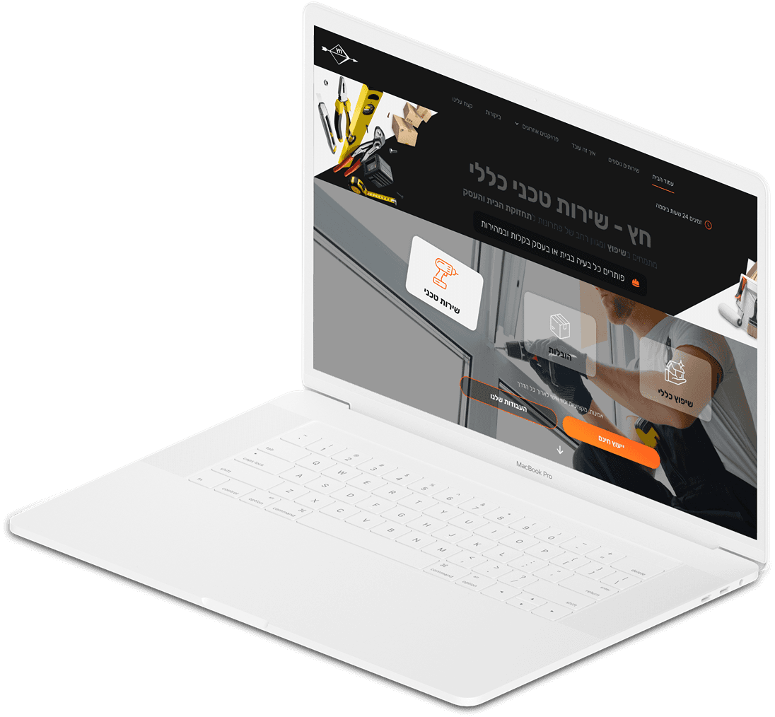
I have designed a website for a construction and renovation company to attract more clients and reach a larger target audience.
My role: UX/UI designer
Tools:

Hetz
Project Overview
I have designed a website for a construction and renovation company to attract more clients and reach a larger target audience.
My role: UX/UI designer
Tools:


Design Process
The problem
Renovating our home can be a difficult task with a lot of misleading information and frustrations, such as finding a professional contractor, managing expenses and project costs, estimating time and duration, and, most importantly, achieving the desired final result.
Research
Most of my research during the project based on online research, people's feedback about contractors they've hired, and competitor analysis.
Conclusions
People looking for a good constructor value professionalism, timely schedules, clear communication, a tidy workspace, and fair prices.
Style Guide
Colors
#275AB2
#AB281C
#080808
#FBFFFE
Icons

Typography
For text
Rubik
Regular
Bold
Design Elements



Landing Page Animation
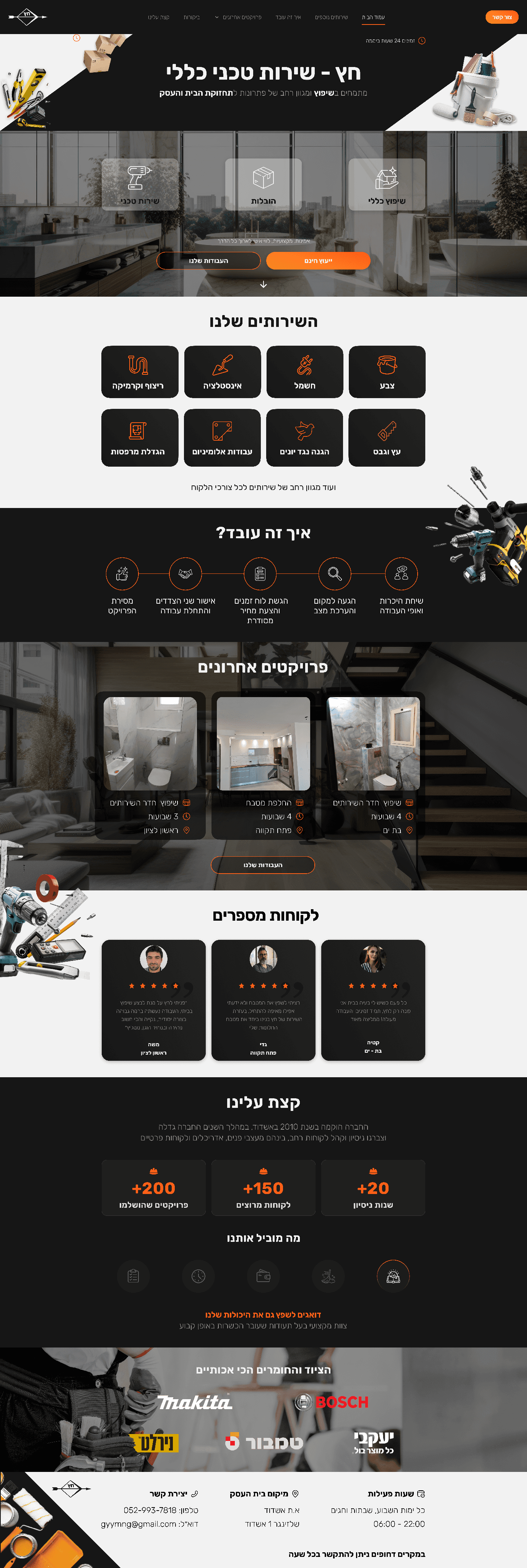
Home Page
User's Feedback
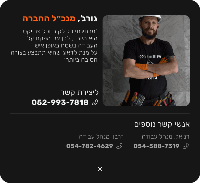
A week after the site was published, my client contacted me and informed me that users couldn't find the email address of the business on the site.

The card contains only phone numbers for contacting because during the project, my client expressed his preference for contacting clients via calls or text messages.
When the user clicks on one of the CTA buttons, a card popup appears on the screen with contact info.
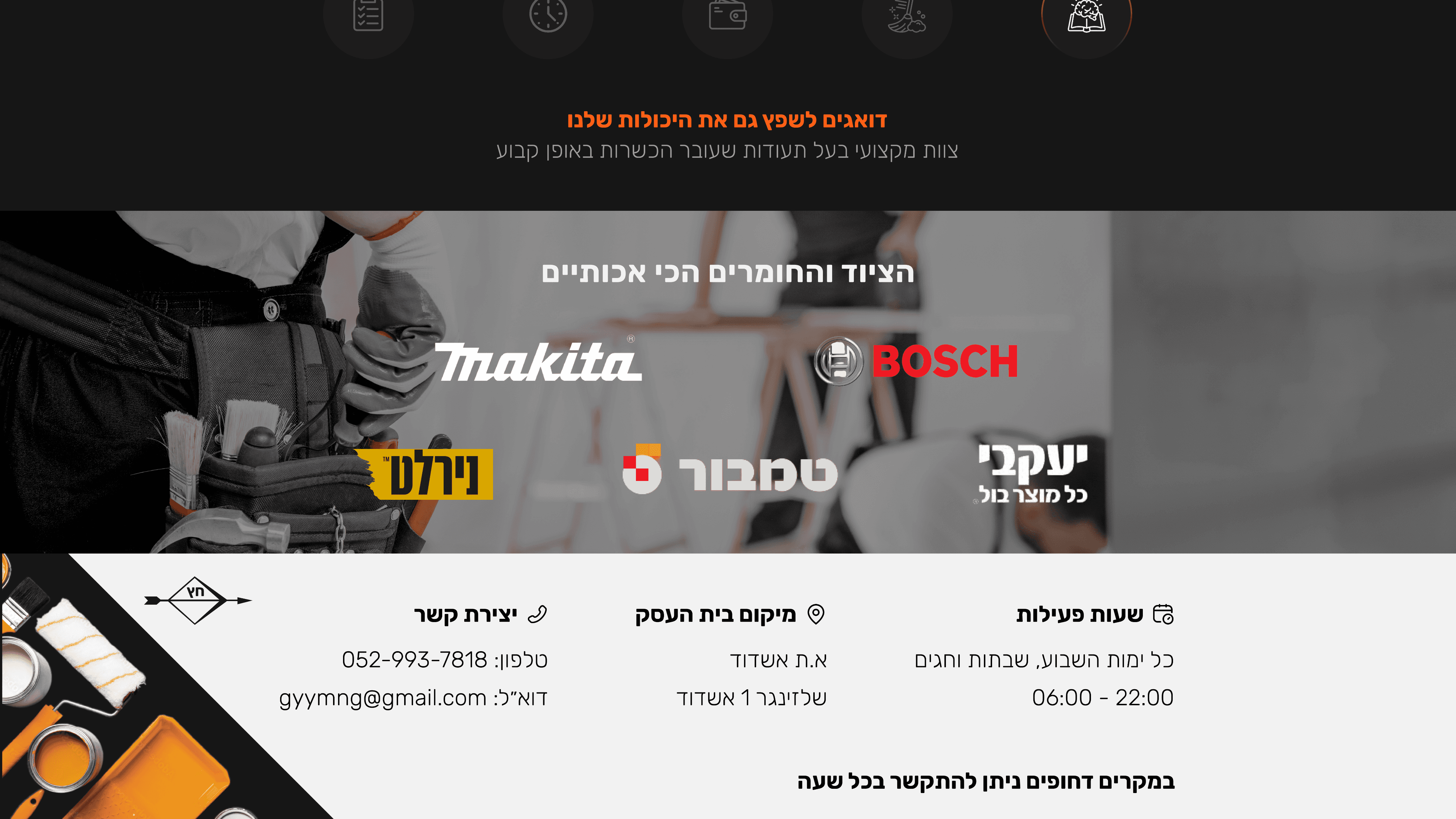
The email address of the business was placed at the bottom of the website, along with other details about the business.
I had to make some changes to the card design so that users can easily find the information they are looking for.
Delete unnecessary visual elements to reduce the visual noise
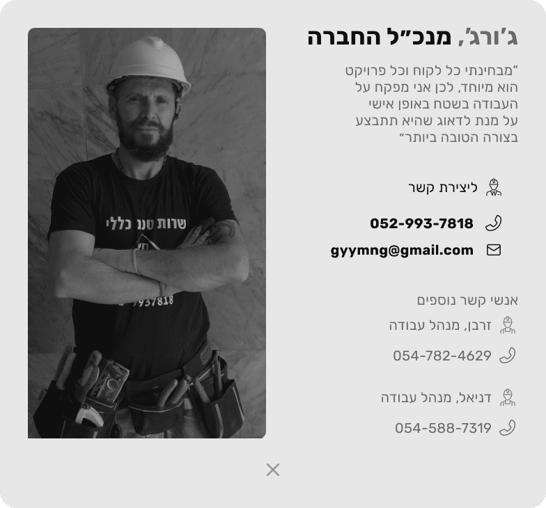
To improve the connection between the content, I refined the composition and layout.
the image of my client on the left side and the contact details on the right side.
To create a better hierarchy I reduced the size of the “other contacts” section
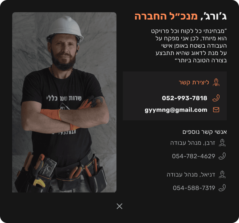
I’m used the lighter shade of neutral colors to popup the most important information on the card.
I applied the orange color from the project’s color palette only to the most necessary information for the users, making it easier for them to understand who they are going to contact.
Make the image of my client darker to attract less attention.
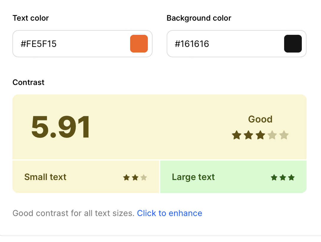
Improve the contrast of the orange color between the small text or elements and the background color to reduce strain on the eyes.
Improved orange color
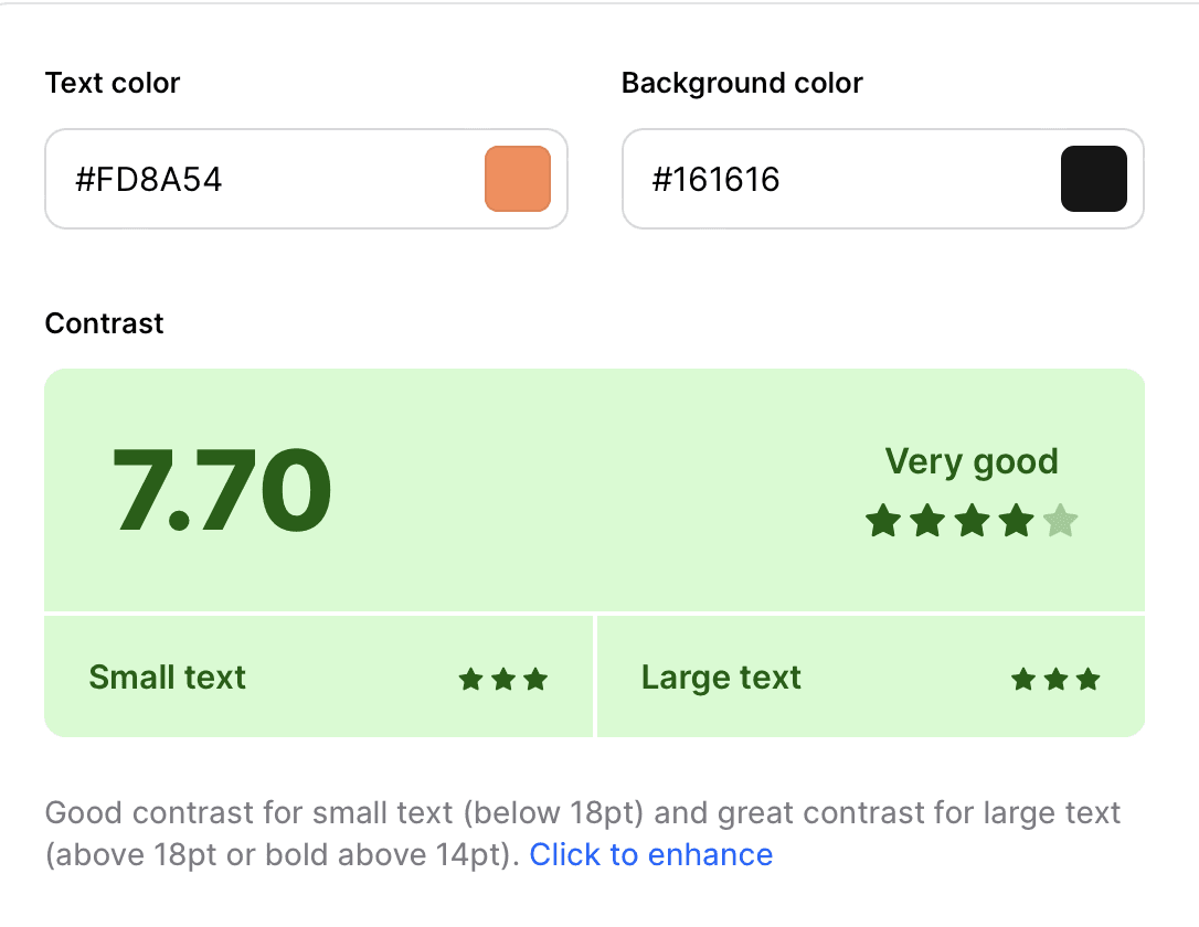
Previous orange color
Final Design

Hetz Website
Thank You For Watching
Let’s stay in touch :)
052 - 6599 - 807
alexghaiman@gmail.com
Other Projects
Project Overview
I have designed a website for a construction and renovation company to attract more clients and reach a larger target audience.
Hetz
My role: UX/UI designer
Tools:

Project Overview
I have designed a website for a construction and renovation company to attract more clients and reach a larger target audience.
Hetz
My role: UX/UI designer
Tools:


Design Process
The problem
Renovating our home can be a difficult task with a lot of misleading information and frustrations, such as finding a professional contractor, managing expenses and project costs, estimating time and duration, and, most importantly, achieving the desired final result.
Research
Most of my research during the project based on online research, people's feedback about contractors they've hired, and competitor analysis.
Conclusions
People looking for a good constructor value professionalism, timely schedules, clear communication, a tidy workspace, and fair prices.
Style Guide
#275AB2
#AB281C
#080808
#FBFFFE
Icons


Typography
For text
Rubik
Regular
Bold
Landing Page Animation


Home Page


Thank You For Watching
Let’s stay in touch :)
052 - 6599 - 807
alexghaiman@gmail.com
